This article is more than 1 year old
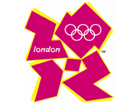
2012 Olympics logo debuts to whalesong
Rebranding madness infects 'star-studded' launch
LogoWatch Olympics minister Tessa Jowell clearly spent too much time in the chill-out room absorbing whalesong from her iPod at the "star-studded" launch of the 2012 Olympics logo in London's Roundhouse earlier today, since she described the rather frightening graphic as both "an invitation and an inspiration" as VIPs battled to verbally out joss-stick each other.
 According to the official blurb, the logo is "modern and will be dynamic, evolving in the years between now and 2012" and furthermore "symbolises the Olympic spirit and the ability of the Games to inspire people to take part - not just as spectators, but as volunteers, in the Cultural Olympiad and more".
Seb Coe warmed up the crowd with: "London 2012 will be 'Everyone's Games', everyone's 2012. This is the vision at the very heart of our brand. It will define the venues we build and the Games we hold and act as a reminder of our promise to use the Olympic spirit to inspire everyone and reach out to young people around the world. It is an invitation to take part and be involved."
According to the BBC, International Olympic Committee prez Jacques Rogge quickly upped the ante with: "This is a truly innovative brand logo that graphically captures the essence of the London 2012 Olympic Games - namely to inspire young people around the world through sport and the Olympic values. Each edition of the Olympic Games brings its own flavour and touch to what is now well over a century of modern Olympic history; the brand launched today by London 2012 is, I believe, an early indication of the dynamism, modernity and inclusiveness with which London 2012 will leave its Olympic mark."
Not to be outdone, Tony Blair weighed in with: "We want London 2012 not just to be about elite sporting success. When people see the new brand, we want them to be inspired to make a positive change in their life. London 2012 will be a great sporting summer but will also allow Britain to showcase itself to the world."
Finally, and evidently well fired up on cetacean mood music, Jowell flourished: "This is an iconic brand that sums up what London 2012 is all about - an inclusive, welcoming and diverse Games that involves the whole country. It takes our values to the world beyond our shores, acting both as an invitation and an inspiration. This is not just a marketing logo, but a symbol that will become familiar, instantly recognisable and associated with our Games in so many ways during the next five years."
For the record, the logo was designed by Wolff Ollins, which works in the "reinvention business". The company's previous notable reinventions include BT's infamous trumpet bloke - a rebrand which cost a paltry £50m and was eventually dumped for a £5m rehash of the BT Openworld brand frontage.
Regarding the 2012 Olympics paradigm shift, Wolff Ollins is keeping tactfully schtum on what it might actually represent. A quick straw poll at Vulture Central quickly revealed that most hacks consider it a pretty graphic representation of the state of London's transport infrastructure following its complete collapse on day one of the games. We shall see. ®
