This article is more than 1 year old
Qantas spunks AU$100m on 'pterodactyl'
Roo lovers hopping mad at revamped logo
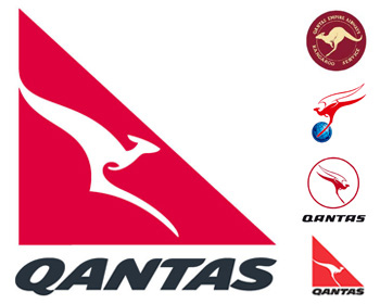
LogoWatch Designers have reacted with somewhat less than enthusiasm to Qantas's revamped logo - rolled out this week with the usual fanfare of trumpets.
 The new-look roo, the fifth incarnation of the original 1944 marsupial, is an adaptation of the 1984 design which saw Skippy's wings clipped but remaining resolutely kangarooesque.
The press release explains the company felt "the time was right for a new adaptation of the airline's logo, in keeping with Qantas' increasing focus on contemporary design for its in-flight and on-the-ground products".
Qantas executive general manager John Borghetti explained: "This move also reflects the changing structure of our new aircraft - for example, the shape of our new kangaroo is a great fit for the tail of the A380 and other new generation aircraft. We will also be progressively rolling out the new branding across the airline in the lead up to the delivery of the first A380 in August 2008."
And therein lies the rub. According to news.com.au, the design "had been forced by the narrowing tail designs of the new generation of jets". A source close to Hans Hulsbosch, head of Hulsbosch Communications and the man responsible for the outrage, said: "We found with the no-paint zones on the A380, where the foot went through the tailplane, it looked as if it had been amputated."
Hulsbosch himself offered: "The Qantas logo is one of the most recognised symbols of Australia in the world, with a strength that has been built over many years. We took great care to carry this legacy into the new design, but also gave it a very contemporary flavour with more organic, flowing lines, and a typeface created exclusively for Qantas that is crafted to match the curves of the kangaroo."
Ron Dyer, the chap who did the 1984 redesign, was having none of it, describing himself as "speechless" at the new logo but recovering sufficiently to offer: "What do I think of it? What is it?"
Dyer, who questioned why Qantas would spunk an estimated AU$100m on the rebrand, further thundered: "Jesus Christ, there is nothing stylish about that kangaroo whatsoever.If you only knew how long it took us to get that whole thing worked originally."
Queuing up behind Dyer to administer a shoeing was design specialist John Ford of The One Centre, who reckoned the new logo "lacked the elegance of the kangaroo that had graced the tails of Qantas planes since 1984". He said: "Dare I say it, it looks more like a pterodactyl than a flying kangaroo."
Garry Horner, creative director of Whybin TBWA in Sydney and "one of Australia's most acclaimed advertising men", warned Qantas: "I think people find great comfort in the iconic images of the brands they purchase or use. It was a great logo and if it's not broken, don't fix it." ®
Bootnote
G'day and ta very much to Simon Harvey for the tip-off.
