This article is more than 1 year old
Motorola Razr 2 V8 mobile phone
Cutting... er... edge
Review To say it’s been difficult for Motorola to follow up the massive hit of the Razr V3 with something better is an understatement. Since its release to the sounds of jaws dropping in mid-2004, the Razr has gone from high-end must-have to mass-market. Now comes the Razr 2 V8, billed as the next-gen V3. So does it offer more than just another face-lift?

Moto's Razr 2: premium quality feel
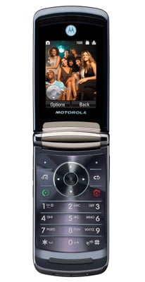
The Razr 2 is thinner than the original – a monumental 2mm thinner, in fact. It's a mere 11.9mm thick, but a fairly standard sized clamshell otherwise. At 117g, it's quite heavy, however, the result of a heavy-duty stainless steel frame combined with metal and glass housing. Like the original, the materials used to make the Razr 2 are the key ingredients that make it look and feel a premium quality product.
On the outside of the clamshell, Motorola has used chemically hardened glass, spun metal and chrome to create an impressively tough and glossy phone. That hard-as-nails glass is used down the front of the phone, covering a remarkably large external display, but it's a fingerprint magnet. The screen is a 2in, 320 x 240, 262,000-colour screen, with some touchscreen control for the music player.
The external screen puts to shame many a mobile’s main display, and almost matches in size its own internal, 2.2in screen - another QVGA 262,000-colour panel. The main display sits above the thin, flat keypad: numbers, soft-menu keys and shortcut buttons are neatly lined up in rows and columns, making it simple to tap out texts. A central navigation pad rounds out the controls - this can be user-programmed for shortcuts to particular functions too.
Over the years, Motorola has suffered much criticism of its menu system's usability. With the V8, however, the user interface is notably easier to master. The main menu is laid out as a grid of icons - though it can be switched to a simple list, if you prefer. It’s regular, intuitive mobile stuff: click on icons and you get sub-menus, where you can scroll down or press corresponding numbers to skip to specific options.
