This article is more than 1 year old
Mac OS X 10.5 Leopard - Finder
Part 1 - the new look'n'feel
Nor can you opt for a Docked folder icon that matches the kind of file it contains rather than one of the icons from the folder's contents. I can see how a UI designer might once have thought it a neat idea to replace the traditional folder icon with a visual representation of all the items kept within, but this stacking approach not only replicates the notion of a pile of papers, but also the inability to get an instant understanding of what's in the stack without pulling it apart. That, however, is exactly what a custom folder icon delivers - it gives you an immediate visual indication of what's held within.
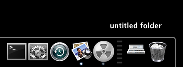
What kind of document do I file here?
That's why Mac OS X has custom folder icons for the main items in the Home folder: Library, Music, Movies etc. I make my own with Folder Icon X, which continues to work with Leopard. But put one of these in the Dock and that indicator may as well be gone.
Now, some folk will like this stacked document approach. Good for them, I say - each to his or her own. But why limit either their choice or mine, when a couple of check boxes in the Dock preferences pane allows us each to pick the approach we prefer?
It's this insistence that Apple's right and we're not that irritates me, a point which takes me to the translucent menu bar. I don't mourn the loss of the curves in the top right and left of the screen - though their absence is odd when we have curves everywhere else - but I do like my menu bar to be a consistent colour, not a blanched version of whatever wallpaper lies beneath. Especially when it means there's a mismatch between menu bar and menu: menus are translucent too, but with a much higher level of opacity, enough to suggest a virtual hierarchy of depth but not to make them look a mess. Not so the menu bar.
I've fixed this by adding a 22-pixel 50 per cent grey tint to the top of all my wallpaper images, but that's a brute force approach and I look forward to a third-party hack that sorts this out automatically. Here's one such: OpaqueMenuBar.
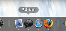
Clearer Dock labels
There are improvements: I like menus' rounded corners and the new, easier to read name labels that appear as you move the pointer across the Dock. I like the way Apple's added a search text-entry box in the Help menu. Though why all the menu entries below it have to be in smaller text size than all the other menus is anyone's guess. Maybe Apple has a reason, but I'm darned if I can guess what it might be.
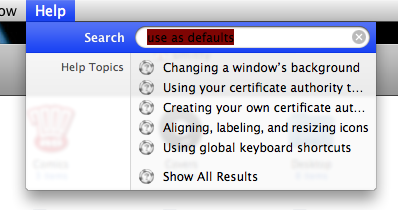
The new help menu: but why the tiny menu options?
There's no doubt in my mind, however, that the Finder's new window look is an improvement. The design, taken from iTunes, makes the sidebar more usable, if only because there's room for more entries now, and a better structure in which to place them. There should be a + icon at the bottom to allow you to add new search folders.
And why do search folders have an iPhoto-like icon sizing slider that goes way beyond the 128 x 128 maximum icon size in regular windows? If it's useful here from a file-contents preview perspective, it's useful in ordinary icon views, surely? Leopard supports icons at 512 x 512, incidentally, but of the regular folder views on Cover Flow makes use of them.
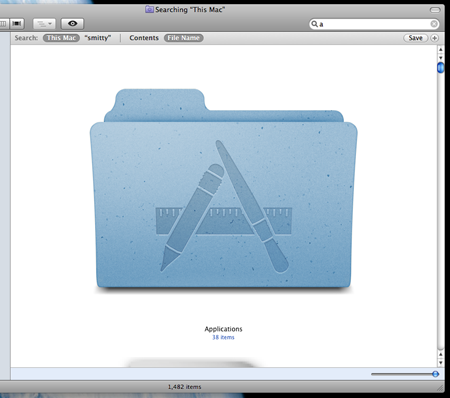
Really big icons, anyone?
I welcome the return of the ability to search for filenames, but I can't get it to work fully. Type 'com.apple.' and select 'This Mac' and 'Filenames' in the search bar, and nothing will show up, despite the hundreds of files that begin with that string within your Preferences folder.
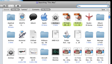
Proper filename searching returns
