This article is more than 1 year old
Arctic ice refuses to melt as ordered
There's something rotten north of Denmark
Just a few weeks ago, predictions of Arctic ice collapse were buzzing all over the internet. Some scientists were predicting that the "North Pole may be ice-free for first time this summer". Others predicted that the entire "polar ice cap would disappear this summer".
The Arctic melt season is nearly done for this year. The sun is now very low above the horizon and will set for the winter at the North Pole in five weeks. And none of these dire predictions have come to pass. Yet there is, however, something odd going on with the ice data.
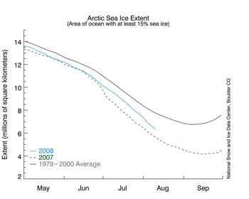
The National Snow and Ice Data Center (NSIDC) in Boulder, Colorado released an alarming graph on August 11, showing that Arctic ice was rapidly disappearing, back towards last year's record minimum. Their data shows Arctic sea ice extent only 10 per cent greater than this date in 2007, and the second lowest on record. Here's a smaller version of the graph:

The National Snow and Ice Data Center (NSIDC)'s troublesome ice graph
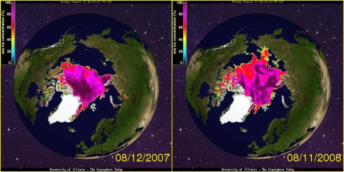
The problem is that this graph does not appear to be correct.* [See Editor's note, below] Other data sources show Arctic ice having made a nice recovery this summer. NASA Marshall Space Flight Center data shows 2008 ice nearly identical to 2002, 2005 and 2006. Maps of Arctic ice extent are readily available from several sources, including the University of Illinois, which keeps a daily archive for the last 30 years. A comparison of these maps (derived from NSIDC data) below shows that Arctic ice extent was 30 per cent greater on August 11, 2008 than it was on the August 12, 2007. (2008 is a leap year, so the dates are offset by one.)

Ice at the Arctic: 2007 and 2008 snapshots
The video below highlights the differences between those two dates. As you can see, ice has grown in nearly every direction since last summer - with a large increase in the area north of Siberia. Also note that the area around the Northwest Passage (west of Greenland) has seen a significant increase in ice. Some of the islands in the Canadian Archipelago are surrounded by more ice than they were during the summer of 1980.
The 30 per cent increase was calculated by counting pixels which contain colors representing ice. This is a conservative calculation, because of the map projection used. As the ice expands away from the pole, each new pixel represents a larger area - so the net effect is that the calculated 30 per cent increase is actually on the low side.
So how did NSIDC calculate a 10 per cent increase over 2007? Their graph appears to disagree with the maps by a factor of three (10 per cent vs. 30 per cent) - hardly a trivial discrepancy.
What melts the Arctic?
The Arctic did not experience the meltdowns forecast by NSIDC and the Norwegian Polar Year Secretariat. It didn't even come close. Additionally, some current graphs and press releases from NSIDC seem less than conservative. There appears to be a consistent pattern of overstatement related to Arctic ice loss.
We know that Arctic summer ice extent is largely determined by variable oceanic and atmospheric currents such as the Arctic Oscillation. NASA claimed last summer that "not all the large changes seen in Arctic climate in recent years are a result of long-term trends associated with global warming". The media tendency to knee-jerkingly blame everything on "global warming" makes for an easy story - but it is not based on solid science. ®
Bootnote
And what of the Antarctic? Down south, ice extent is well ahead of the recent average. Why isn't NSIDC making similarly high-profile press releases about the increase in Antarctic ice over the last 30 years?
The author, Steven Goddard, is not affiliated directly or indirectly with any energy industry, nor does he have any current affiliation with any university.
* Editor's note:
Walt Meier, research scientist at the NSIDC, has contacted us disputing the validity of Steven Goddard's methodology, and of his use of University of Illinois data to question the NSIDC's charts. We accept that these two data sets are not directly comparable, and that the University of Illinois data does not provide support for Goddard's charge that the NSIDC data is incorrect. We reproduce Walt Meier's response below. Walt Meier as provided further detail on the calculation of sea ice area and extent in the comments to this article:
The author asserts that NSIDC's estimate of a 10% increase in sea ice compared to the same time as last year is wrong. Mr. Goddard does his own analysis, based on images from the University of Illinois' Cryosphere Today web site, and comes up with a number of ~30%, three times larger than NSIDC's estimate. He appears to derive his estimate by simply counting pixels in an image. He recognizes that this results in an error due to the distortion by the map projection, but does so anyway. Such an approach is simply not valid.The proper way to calculate a comparison of ice coverage is by actually weighting the pixels by their based on the map projection, which is exactly what NSIDC does. UI also does the same thing, in a plot right on the same page as where Mr Goddard obtained the images he uses for his own analysis:
http://arctic.atmos.uiuc.edu/cryosphere/IMAGES/current.365.jpg
The absolute numbers differ between the UI and NSIDC plots because UI is calculating ice area, while NSIDC is calculating ice extent, two different but related indicators of the state of the ice cover. However, both yield a consistent change between Aug. 12, 2007 and Aug. 11, 2008 – about a 10% increase.
Besides this significant error, the rest of the article consists almost entirely of misleading, irrelevant, or erroneous information about Arctic sea ice that add nothing to the understanding of the significant long-term decline that is being observed.
Steven Goddard writes: "Dr. Walt Meier at NSIDC has convinced me this week that their ice extent numbers are solid. So why the large discrepancy between their graphs and the UIUC maps? I went back and compared UIUC maps vs. NASA satellite photos from the same dates last summer. It turns out that the older UIUC maps had underrepresented the amount of low concentration ice in several regions of the Arctic. This summer, their maps do not have that same error. As a result, UIUC maps show a much greater increase in the amount of ice this year than does NSIDC. And thus the explanation of the discrepancy.
"it is clear that the NSIDC graph is correct, and that 2008 Arctic ice is barely 10% above last year - just as NSIDC had stated."
