This article is more than 1 year old
iRiver P7 8GB portable media player
Playing to win?
Review Here at Reg Hardware, we’ve been given to wonder if iRiver has rather lost the plot of late. Sure, the Lplayer was a decent enough bit of kit, but the E100 and Spinn? Writing, “could do better” on their end of term report cards would have been polite in the extreme. However, some of the devices on the iRiver booth at the 2009 CES gave us cause for optimism, in particular, the P7.

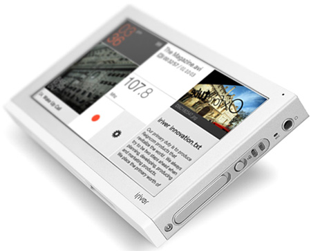
iRiver's P7: its many refinements reveal learning from past mistakes
As a flash-based PMP with a 4.3in 480 x 272 pixel screen, the P7 can't avoid going head-to-head with Cowon's O2. In the first round – aesthetics – it has the Cowon well beaten. To start with at 173g and 112 x 73 x 13mm, it’s both smaller and lighter. It also has a smart brushed aluminium body that is very nice to the touch and which combines with the white highlights on its top and bottom to make it one of the most attractive PMPs we have come across.
External controls have been kept to a minimum and consist of nothing more than a very small volume and menu touch pads on the top of the device, alongside the on/off button. On the right hand side you will also find a 3.5mm headphones jack, lock slider, a loop to hang the stylus off and a covered MicroSD card slot which – despite a small finger-indent – required the use of a sharp implement to push cards in and out. At the bottom is a proprietary USB port with a sliding cover.
The flush USB port cover lets the P7 dock with a cradle which also houses a secondary battery and a bigger speaker – the one fitted to the back of the P7 is fairly useless – though whether or not it will ever make it to the UK is another matter.
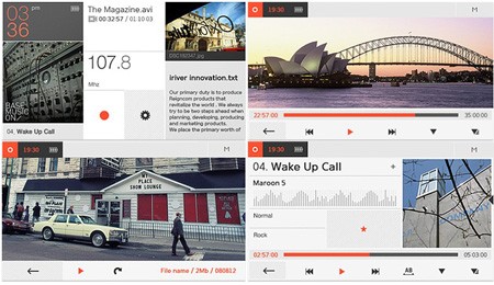
iRiver call the P7's touch screen UI design 'Magazine' because it looks like a magazine cover. Well, sort of. Odd name notwithstanding, it’s a very nicely thought out and executed bit of design, for which iRiver deserves a pat on the back.

The Magazine interface continually updates as different files are accessed
The basic home page layout is simplicity itself, with different parts of the screen taking you directly to either your music, video or text files, the radio, recording and settings pages or the time and date page – this last being home to a calculator, world clock and calendar. The picture, music and text areas are represented by the last file accessed – so the 'magazine' is constantly changing its appearance - while the radio button always shows the current frequency.
