This article is more than 1 year old
Nokia N97
Mobile content creation tool, anyone?
Could no one at Nokia, during the many stages of design and development, have said, "STOP!" ? It defies belief that something so ugly could be released. Indeed, my initial experience of the UI was horrible: the widgets look great but suck RAM and impact the stability of the phone. Once I'd got rid of the Facebook widget, and simply used the static widgets for contacts and application shortcuts, the experience improved a great deal.

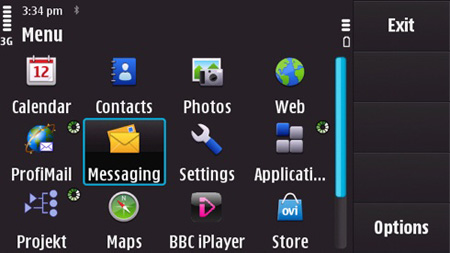
When buttons go missing: unused screen real estate on the N97
There's a new notification area which provides fast access to alarms, unread messages and Bluetooth, if active. As an iPhone user, I got bored with the repetitive steps needed to set display brightness or toggle Bluetooth on and off on this Apple device. It's a chore, most manufacturers alleviate by making these functions more accessible. So the N97's little notification panel appears quite useful.
Frequently, the UI gets the job done as clunkily as possible. Evidently, S60 has stagnated while Nokia's rivals have invested in some real innovation. Moreover, S60 5th Edition isn't a ground-up UI designed for touchscreens, which makes the iPhone, Pre and Android so elegant to use. When just activating something on the N97 requires two clicks and some latency is involved – such as changing a theme – you find yourself continuing to click because the selection hasn't registered.
Navigating lists and check boxes is far too often a chore. Why does configuring the right soft key show the options – the installed applications – as a list of radio buttons, just as it did in 2002? It's 2009 now, and that's a very long list. The photo browser shows up the UI quite cruelly, and will leave you pining for the multitouch gestures and brilliant rendering of the iPhone, and its most modern rivals.
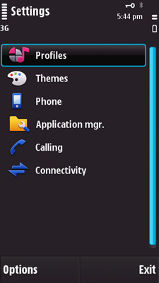
In other areas, you can see Nokia is working hard to mitigate its legacy burden. Settings have been a disaster on S60 from the start, but it's gradually coming close to matching the clean, consistent organisation of a BlackBerry or a Sony Ericsson.

Settings are more logically organised
Applications gain a toolbar on the right that, while making thumb navigation easy, sucks a lot of usable display area from the application itself. In the messaging client, there's no way to toggle or customise this enormous bar.
