This article is more than 1 year old
Ice Cream Sandwich
Just how tasty is Android 4.0?
Review No new version of the Android mobile operating system has been quite so eagerly awaited as v4.0 or Ice Cream Sandwich as it’s more colourfully known. The reason is not hard to explain: Android has streaked ahead of iOS in the bums-on-seats stakes but there is still the feeling that the user interface lacks the polish and grace of Apple’s mobile platform.
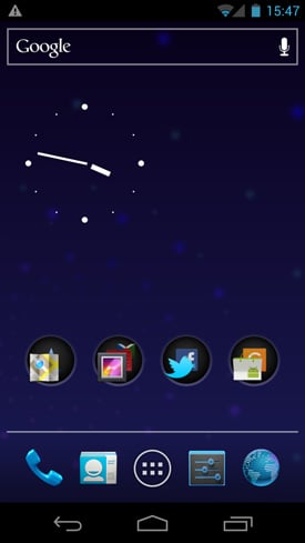

Homescreen and Honeycomb-style blue border show when moving icons
ICS is also charged with unifying Android’s look and feel across both phones and tablets and those devices likes the Samsung Galaxy Note that are a little bit of each. You could say that ICS is what v3.0 Honeycomb would have been had Google not rushed it out to try to compete with Apple’s iPad.
Let’s start with the looks. You’d have to be blind not to see that in terms of design, with its Honeycomb-like theme, ICS is a quantum leap forward over previous incarnations of Android. Taking inspiration from iOS and WinPho 7, the UI is now replete with visually pleasing animations that give the impression that the UI is alive to your touch. This new look is most obvious when adding or removing home screen items.
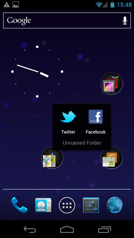
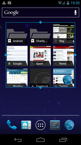
Folder contents and resizeable widgets
This process is now accompanied by the appearance of blue border lines and icon corner markers, just as it is in Honeycomb. Sadly you can no longer add things with a simple long-press on the screen but only from the app tray which now also scrolls into a widget catalogue.
Once you’ve found and placed your widgets ICS now lets you re-size them, a major step forward and the Honeycomb feature I welcome the most. With the screen now playing host to a row of virtual system buttons – as well as a five-button dock – you need to get used to the complete absence of fascia controls, be they touch sensitive or physical.
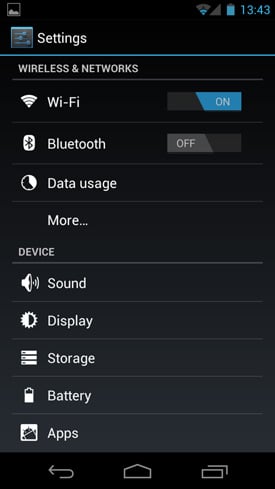
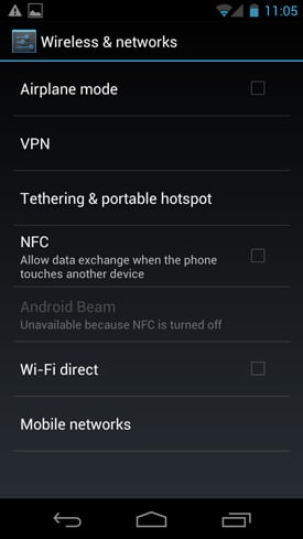
Settings and networking
Aesthetically, this will make for much cleaner handset designs with a higher screen-to-phone size ratio but it makes me wonder how ICS will look on existing handsets that already have fascia buttons. The traditional Android search/menu/home/back buttons have been replaced with a Honeycomb-style offering of back, home and running apps. The search bar is now a fixed widget present on all your home screens.
