This article is more than 1 year old
Metro breakdown! Windows 8 UI is little gain for lots of pain
Nice OS, shame about the interface
Taking the metro: in pictures
The problems begin with the Metro screen, which is the fullscreen overlay now invoked every time you hit the Windows key, and the mandatory replacement for the old start menu.
This is what Microsoft wants you to see:

The official MS publicity shot for the Metro screen
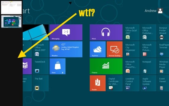
But if you scroll to the right, this is what you actually see:

The Metro screen in real life
You see your iSCSI Initiator, your ODBC Data Sources and all your uninstallers. Microsoft hasn't hidden anything or cleaned it up. It's like when the camera accidentally wanders to the side of the soundstage and you see the backs of all the props.
So do you get anything from this new compulsory widget layer? Well, the quality of Metro apps varies, as you can see. The Maps app is very simple, so simple you can’t drop a pin, in fact. This next screenshot is a Twitter feed in the People app. Bear in mind that Microsoft specifies a minimum screen width of 1366 pixels for Windows 8. And look what you get.
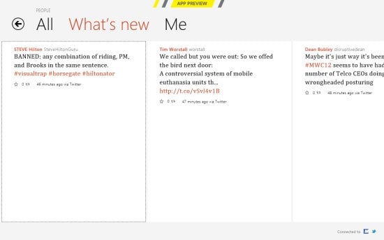
Metro apps in Win8: great use of space
In time, no doubt, we’ll get more sophisticated desktop Metro apps – with the extra uncertainty that they won't run on a Windows Phone, and smaller devices. Ho hum.
Here's an example of both over-simplification and duplication, two issues which plague this release. Finding common items has become a crapshoot. There are two control panels, this being the simplified, Metro settings panel.
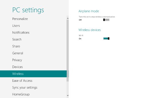
Very nice. Now where's the Bluetooth toggle? Phones have them. It's a trick question, because it's not there.
Things get quite Heisenberg from this point on. Various options float in from the right hand edge of the Metro screen: Search, Share, Devices and Settings; Microsoft calls them "charms". Click Devices and the only item populating it is "Second Screen". The Windows 7 devices page has been ripped out of Computer and unhappily relocated in Metro Settings:
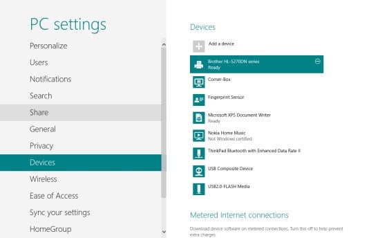
Now you can't actually do anything with the devices here. Want to check the toner level of that Brother laser printer, or print a test page? Tough. Right click, and nothing happens.
Another strange inconsistency is task-switching. This seems to be something the Red Guard doesn't want you to do. In last year's developer preview of Windows 8, it wasn't possible - you had to swipe through all your applications one by one. Like you do on Windows Phone. With a back button.
Microsoft has restored Alt-Tab, which now works as it has for the past 20 years (it was introduced in v3.1):
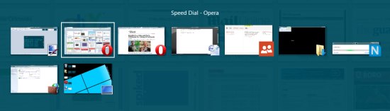
But you're not supposed to use it in this brave new Metro World, you bourgeois recidivist! You're supposed to use Win-Tab. But look what happens when you do:
Win-Tab slides open a vertical task bar on the left, with thumbnails of your running apps. Except it doesn't. Here, Opera and Paint.net and a couple of Explorer windows are running, but not displayed. As task-switching goes it's useless.
The most persistent annoyance is being thrown back into Metro when you don't want to be, and while you can change the default handlers for every application Microsoft is going to insist on Metro.
The fix? Make Metro optional
This is just folly. Underneath we have a steadily improving OS, and we have a decent UI layer designed for smaller touch devices. That's all fine.
I have nothing against Microsoft introducing Metro as an option, as it did with Active Desktop and Windows Widgets.
But inserting Metro into our everyday workflows causes many more context switches (modal switches, in the jargon) than we need. If you're not on a touch device, there's lots of pain for very little gain. We are fairly robust creatures who can cope with context switches and UI idiosyncrasies, and the web forces us to do it more often than any UI purist would want (Facebook has its own peculiarities, Twitter and LinkedIn have their own weird design quirks too.)
Microsoft should remember computers are the things getting between us and what we want to do, and making Metro - something so inappropriate for non-touch users - mandatory is completely unnecessary. Time to tame the Metro Guard, I think. ®
