This article is more than 1 year old
Data visualization: Big Data's hot cousin
Clever coders make data fun and easy, as vendors add tools to catch up
Moritz Stefaner calls himself a “Truth and Beauty Operator”. But if you don't understand what that means, he'll translate to the safer “Freelance information Visualizer” and explain that “Large companies approach me with large data sets they want visualized. I take their data and turn it into something beautiful.”
Beauty is important to Stefaner because he feels it is a way to address the problem of data overload.
“The amount of data we have is exploding,” he says, reciting the mantra. “I think a lot of really interesting apps are possible because we have so much data. It's not something we can make sense of. Data visualization brings it into a human format. We can abstract data into forms humans can really relate to. We're not good at relating to numbers, but we can relate with an image.”
Andrew Vande Moere, whose Infosthetics blog is an influential site for the visualization community, says the power of data visualization is that it demonstrates how things are correlated.
“I always discuss Al Gore on the elevator in An Inconvenient Truth,” he says. “That sticks in your mind.”
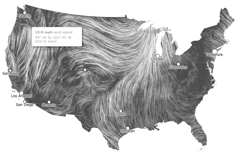
That desire for beauty, utility and insight sees data visualizers create animations and interactive graphics, and their output can be stunning. The visualization below, for example, is a snapshot of an interactive map of wind patterns across the USA. The live visualization, visible here, builds each line of wind to animate a day's wind into an image that grows in density in an eerily compelling fashion.
The live aspect of the visualization is notable because it allows users to set conditions and customize output. For Ben Hosken, founder of Melbourne visualization company Flink Labs, that playful aspect of visualization is important says he tries to “to build something or find insights in data, with a tool people will want to use more than once.”
Hosken contrasts that approach with business intelligence dashboards, as he aims to create more memorable and interactive tools that allow exploration of data so that users can derive their own insights.
Analyst firm Gartner's James Richardson and Neil Chandler draw a similar distinction, saying dashboards are “good for monitoring and alerting a defined set of measures, but less suited to analysis.” The pair argue, in September 2011 research titled “Who's Who in Interactive Visualization for Analysis and Dashboarding” that dashboards have limited as when “deployed to users who need to perform analysis, they can be perceived as too restrictive.
Visualizations are therefore likely to be aimed at managers who need to understand data, rather than stay abreast of simpler metrics. Big Data is an obvious candidate for visualizations, but Stefaner says smaller data sets also lend themselves to good visualizations. “I did one for a muesli customization service to explore what ingredients were ordered together,” he says. The dataset involved was not enormous. But being able to see what customers ordered allowed deeper insights than a spreadhseet or conventional table.
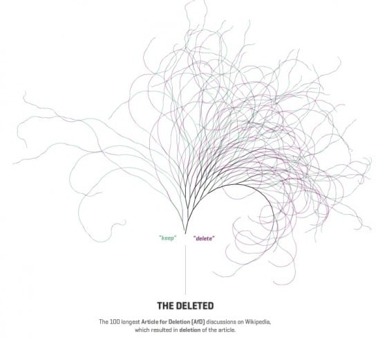
One of Stefaner's creations, an interactive tool for exploring the 100 longest article for deletion discussions on Wikipedia, accessible here shows the history of each article as a line that bends and kinks depending on positive or negative sentiment towards an article. The resulting tree is very striking and, when clicked, performs the useful function of taking users to different entries on Wikipedia's edit history pages for each article.
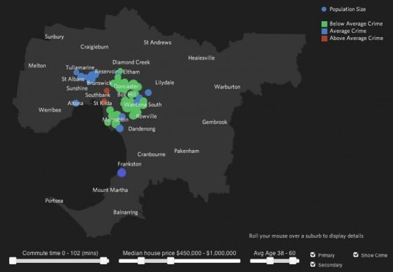
Flink Labs' “Live Where?” visualization allows its users to set a house price and be shown Melbourne suburbs where properties are available for that sum, then add data about presence of schools and crime rates. The resulting experience offers quick, easy and fun access to several data sets.
Business clients for such services, Hosken says, want one of two outcomes.
One is discovery. “An oil company asked for a visualization they can use to explore Bass Strait and find where to drill.”
“The other side is engagement work where someone has a bunch of data and they need to communicate with stakeholders or clients to demonstrate value.”
