This article is more than 1 year old
Nokia's fontastic Pure wins 'design Oscar'
So THAT'S why Microsoft bedded the mobe-maker
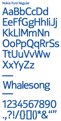
Nokia Pure - the "humanist sans" typeface of the Finnish mobemongerer - has won the graphics category of this year's UK Design Museum Design Awards.
 Nokia Pure was unleashed on an astounded world last year amid much whalesong and joss-stick fug. The font's creator, Bruno Maag, described his typographical masterpiece as an "elegantly simple typeface that doesn't draw attention to itself, but is still distinctive and different".
Nokia went on to crank up the cetacean ambient CD to 11, by asserting Pure was "based on the idea of seamless, fluid motion".
It added: "The generous, rounded characters seem almost to flow into each other, as if there's no beginning and no end. Their movement is gentle and pleasing, like ripples on a pond."
Oh dear, oh dear. Nonetheless, the Design Museum decided Pure's "clarity of purpose and as little design as possible" actually had enough design to merit a prestigious design award.
The overall Design of the Year 2012 honours went to Edward Barber and Jay Osgerby, for the London 2012 Olympic Torch.
The torch, along with the 88 other contenders for the 2012 awards, can be seen at the Design Museum in London, near Tower Bridge on The Thames, until 4 July. There's more here. ®
