This article is more than 1 year old
New! Yahoo! logo! shows! Marissa! Meyer's! personal! touch!
Nine degrees of 'whimsy'
After 18 years the Yahoo! logo has had a redesign, courtesy of newish boss Marissa Mayer and her team, who spent a weekend hammering out the new look for the company.

Behold Marissa's new creation!
"On a personal level, I love brands, logos, color, design, and, most of all, Adobe Illustrator," Mayer wrote on her Tumblr page. "I think it's one of the most incredible software packages ever made. I'm not a pro, but I know enough to be dangerous :)
"We knew we wanted a logo that reflected Yahoo – whimsical, yet sophisticated. Modern and fresh, with a nod to our history. Having a human touch, personal. Proud."
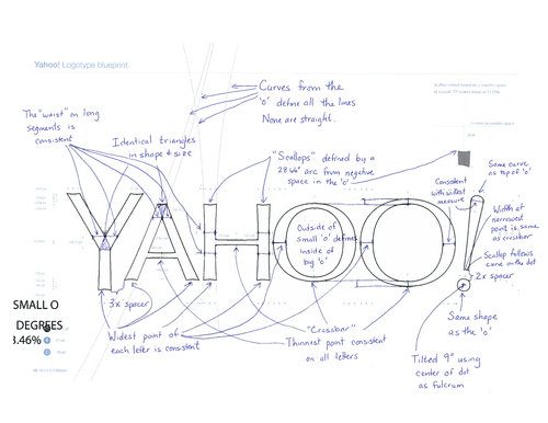
The new logo spurns such boring mundanities as straight lines, which Mayer feels are unnatural and lack a human touch, and uses thin and fat lettering to show "the subjective and editorial nature of some of what we do."
Mayer said she wanted the new Yahoo! logo to reflect the company's past look, to be mathematically consistent, and be close enough to the old design so that users didn't feel Yahoo! was abandoning its heritage. For these reasons, the old serif font was abandoned for sans serif, but with scalloping to reference the old design.
"Our last move was to tilt the exclamation point by 9 degrees, just to add a bit of whimsy," she said. Presumably she had to be careful on that one – if nine degrees is whimsical, presumably 11 degrees is scatterbrained and seven degrees just too conservative.
If this all sounds like marketing bollocks, that's because to a large extent it is. Very few users will look at the newly angled exclamation point and think "Gosh, what whimsy! Back in your box Oscar Wilde!" But to a certain kind of mind it's very important.
Mayer is a known pedant when it comes to logos and branding, and this has caused problems in the past. She's the daughter of an art teacher, has some very specific ideas about design, and isn't shy of making others follow them.
While at Google, she had a major role in shaping the look and feel of the search giant's site, but her laser-focus on such matters annoyed some members of the company. Google's first lead designer Douglas Bowman described the approach championed by Mayer and others as the chief reason he quit the Chocolate Factory and went to Twitter as creative director.
"It's true that a team at Google couldn't decide between two blues, so they're testing 41 shades between each blue to see which one performs better," he said, in an angry 2009 blog post announcing his move.
"I had a recent debate over whether a border should be 3, 4 or 5 pixels wide, and was asked to prove my case. I can't operate in an environment like that."
Yahoo! has been changing its logo daily for the last month, and no doubt Mayer has been looking at the feedback closely and feeding that data back into the final logo. But at the end of the day it's going to take much more than a pretty purple logo to solve Yahoo!'s systemic problems. ®
