This article is more than 1 year old
Windows 8.1: Microsoft's reluctant upgrade has a split-screen personality
El Reg has a sniff around the RTM version
Review Microsoft will release Windows 8.1, a free update for Windows 8, on 18 October. The plan had been for no pre-release code until then, but Microsoft has back-tracked.
The release to manufacturing (RTM) code is now available early to developers and IT professionals via Microsoft’s MSDN and TechNet subscription sites.
There are indications, though, the “release” build is not quite what will be released.
Company vice president Stephen "Guggs" Guggenheimer said: “The primary purpose of Windows 8.1 RTM and Visual Studio 2013 RC availability is for testing as our engineering teams continue to refine and update the product and tools in preparation for Windows 8.1 general availability on October 18.”
Who knows, perhaps SkyDrive – Microsoft’s cloud storage platform, which is prominent in Windows 8.1 – will be renamed in time for general availability following the High Court’s June ruling that it might be confused with BskyB. Microsoft on Monday announced its intention to appeal that decision.
Major changes are unlikely though, so I put the RTM through its paces on a Surface Pro - perhaps its most natural home.
Tablet-desktop mutant hybrid – does it work?
There are two questions to ask of Windows 8.1. The first is how well it delivers as part of Microsoft’s devices and services strategy. In this context, Windows is being reinvented as a tablet-friendly, cloud-centric operating system, with the traditional desktop retained both for compatibility and for heavyweight applications such as Office, Visual Studio, Autodesk AutoCAD or Adobe Photoshop, which do not fit the new-style app model.

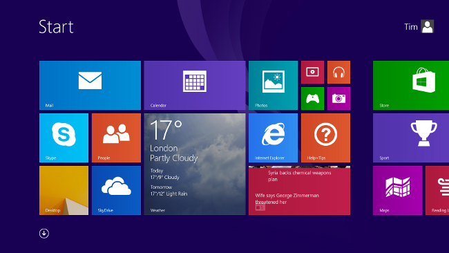
Looks familiar - the Windows 8.1 Start screen, only less straight jacketing than before
The second question is more prosaic. The first release of Windows 8 contrived to alienate existing Windows users, to the extent that many prefer Windows 7 or, if stuck with 8, do their best to make it work like Windows 7. They do this using Start menu replacements and changing file associations for things like images and PDF documents back to desktop applications, to avoid the “Modern” user interface as far as possible. Can Windows 8.1 at least persuade users that it is not actually a downgrade from 7?
Microsoft has gone some way to make Windows 8 less awkward for desktop users, though you sense that it has done so through gritted teeth. Why else is the option to boot to the desktop, rather than the Start screen, buried in Taskbar and Navigation properties, rather than in PC Settings?
That said, if you check this option, along with two other options to “Show the apps view automatically” and to “List desktop apps first”, the effect is dramatic. Not only does Windows now boot to the desktop, but also, when you click the re-instated Start button, you get a list of desktop apps, with smallish icons rather than large tiles, and in familiar groups like “Windows Accessories” and, if installed, “Microsoft Office”.
It is still a Start screen, but for those users who intend to live in the desktop it’s more approachable than before. Fix the file associations, and the transition from Windows 7 becomes easy.

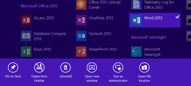
Newly installed apps must be retrieved from deep inside Windows 8.1 and pinned to the Start screen
This being the case, why does Microsoft not have a simple first-use dialog box asking users whether they would prefer a tablet-oriented experience, or a desktop one? There is still, one suspects, a desire to pull users into the new world whether willingly or not; though OEM customisation may mean that Windows 8 does become more desktop-centric out of the box for most users.
The Start screen has another key change. Newly installed apps no longer appear there by default. If you install Office, for example, applications like Word and Excel do not appear in the main tiled view. In order to get it there, you need to scroll down to the Apps view (small icons rather than big tiles), right-click or tap and hold on the icon for Word, and select Pin to Start. Further, you can resize the tiles between Large, Small, Medium and Wide.
In other words, the Start screen is, aside from a few default apps, now a blank canvas for users to customise. While this is a good thing, and makes the Start screen a better app launcher than the old Start menu, there is still an issue for new users who may wonder “where is Office” since by default it is nearly invisible.
