This article is more than 1 year old
Is it a bird? Is it a plane? Is it ... Win Phone 8? No, it's APPLE'S iOS 7
Arr, 'tis colourful. Belike Microsoft weren't lubbers after all
Review Apple's iOS 7 has come some way since its initial preview release and public unveiling back in June at Apple’s Worldwide Developer Conference. Back then the focus was inevitably on the operating system’s new visual styling, and Apple does seem to have taken on board the early criticism of the new look.
The ultra-spindly font Apple design chief Jony Ive had selected was replaced with a more beefy typeface in an early beta, and over time the rougher edges of the tweaked user interface have been polished smooth. This really is a visual update. iOS 7 does feature a number of under-the-hood changes - not all of them for the better - but this is predominantly a fresh lick of digital paint.
But Apple has at least taken the opportunity offered by a skin refresh to look at some of the system's earlier usability issues and address them. It’s tried to ensure, not entirely successfully, that the new style doesn’t get in the way of the content and information the OS and the apps that run on it are trying to present. This is Apple’s notion of “deference”, that “the UI helps users understand and interact with the content, but never competes with it”, as the company’s developer documentation puts it.
Apple being such a design-led company, the interface could never entirely defer to the content. But as any good graphical designer knows, the best design is the one that users don’t notice. iDevice owners will certainly face the "shock of the new" when they download and install iOS 7, but it doesn’t take long for the new look to drift into the background.

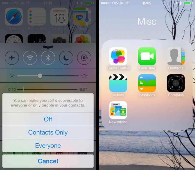
iOS 7 uses translucency to focus the user's attention (left), and for some lesser roles, like folders
Not all of it will, though. Motion is an issue in particular. In a new animation from Apple, when a user launches an app the software's main view fills the screen as if it were growing out from its icon. The view pushes all the other icons off the screen. Like Mac OS X’s "minimise window to the dock" animation, it’s cute for the first few views, but it's ultimately unnecessary. It would be nice to disable it - why waste processor cycles on this kind of thing? Especially when you don’t need to emphasise that a given app is located on a certain part of the screen. Like all the skeuomorphic imagery ripped out of iOS, it’s trying to imply a real-world relationship that’s not there.
One of iOS 7’s accessibility settings promises to reduce all this movement, but it doesn’t stop the animations altogether. In fact, that switch's effect is barely noticeable. But before I turned it off, I kept noticing occasional tiny movements of the wallpaper at the end of animation sequences as if iOS, having put icons and folders back in the right place, needed to nudge the wallpaper slightly by way of celebration. As I say, tiny but very eye-catching, at least until the accessibility setting was applied.
Just like running an app, opening a folder pushes aside all other icons for greater focus; the old linen-like background texture replaced by a translucent window over your wallpaper. iOS also zooms in on the wallpaper image itself, the better to force the user to focus attention on one part of the screen. Closing a folder or quitting an app reverses the animations, which causes some brief moiré pattern weirdness - the Voice Memos app’s sound-wave icon in particular. You didn’t think that one through, did you, Jony?
iOS 7’s translucency effect - it’s like looking through a sheet of heavily frosted glass - is a common component of the new user interface. It’s how the dock area is rendered, for instance, and the new passcode entry screen uses this trick to highlight its much larger and more rapidly tappable buttons. And, yes, a PIN remains the only way to unlock devices other than the fingerprint-reading iPhone 5S.

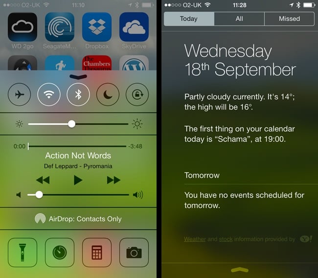
Swipe up: the new Control Centre (left). Swipe down and you get the new-look Notification Centre
The translucency is also wheeled out when iOS 7 needs to stack things on the screen: it puts elements that require the user’s immediate attention, such as popped-up dialogue boxes, literally in focus while all the less important, further-down-the-stack stuff is blurred out as if under a pane of pellucid glass.
I can see the logic of obscuring unnecessary screen clutter to help you concentrate on what you need to attend to and approve. But the slight parallax sliding of the background that often accompanies it is a poorly conceived graphical “because we can” moment.
Consider this piece of pseudery from the developer documentation: “Visual layers and realistic motion impart vitality and heighten users’ delight and understanding.” That tells you all you need to know about iOS 7’s use of movement. It gets in the way of the system's otherwise successfully achieved goal of pushing pertinent information quickly to the fore. The movement is a visual distraction.
As are the new animated wallpapers and the meteorological animations in the Weather app. At least the app-opening animations are completed very quickly, but please, even if they have to be the default, at least let us turn them off.

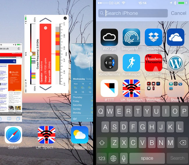
Drag windows up to close their apps in the new multitasking UI (left), or swipe down on the main screen for the search bar
There are improvements. iOS’s search facility can now be accessed by swiping down mid-screen on any of your main pages of icons, though it doesn’t work when you have a folder open. Swipe up from the bottom of the screen and the new Control Centre panel also sits above a blurred view of what lies beneath.
Control Centre (CC) is new to iOS 7, though Android and other mobile operating systems have utilities that are very similar. CC provides long absent one-click buttons for controlling device features such as Bluetooth and Wi-Fi, to put the phone in flight mode, and set the screen-orientation lock.
It also has a screen brightness slider - just one of number of items here that were previously tucked away in the left-most page of iOS 6’s bottom-of-the-screen multitasking menu. CC handily also provides direct access to the Calculator and Camera apps, and the Timer section of the Clock app. What's really handy - and rendering dozens of third-party apps redundant - is a button that lets you use the camera’s flash as a torch.
