This article is more than 1 year old
Phantom Flan flinger: The story of the Elan Enterprise 128
DCP, Samurai, Oscar, Elan, Flan, Enterprise - the micro with six monikers
Italian design
Geoff Hollington say the look of the keyboard was inspired by the work of Italian typewriters-to-technology company Olivetti, which had steered a path away from the thick, blocky keys pioneered by an ergonomics obsessed IBM. The large space bar required the addition of cantilevering to prevent either end getting stuck down, he recalls, and the same mechanism was applied in miniature to the Enter key.
The built-in joystick - which had always been in Robert Madge’s specification, Geoff recalls - was designed by Nick Oakley. It was mounted on a cruciform plastic panel so it would trigger membrane keys set beneath it. The handle screwed on. Those were practical necessities - Oakley’s contribution was the corrugated rubber surround, which helped give the unit a futuristic look but more pragmatically kept the internals sealed away.

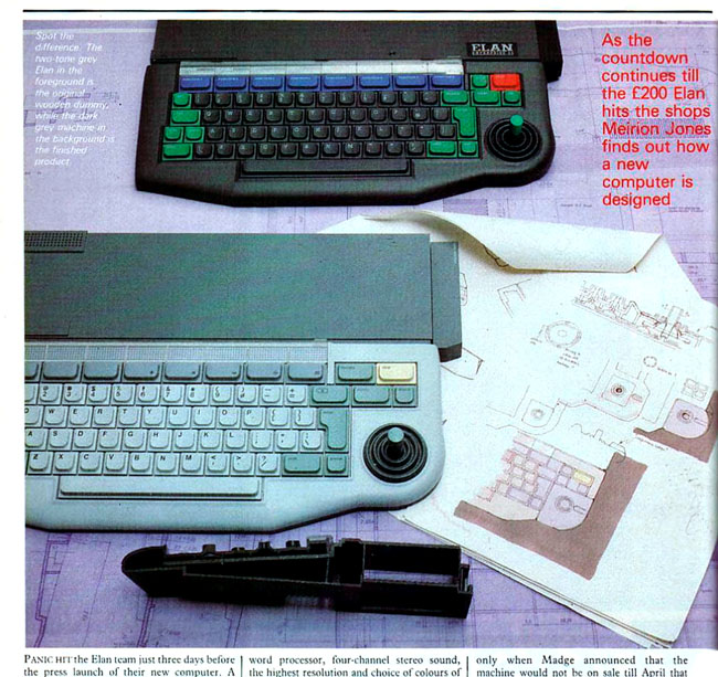
Geoff Hollington’s original colour scheme makes a surprise appearance in Your Computer
In February 1983, model maker Ken Houghton was tasked with producing a mock-up from the designers’ blueprints. It was painted in two shades of grey: the rear, rectangular section was dark grey, the curvy section at the front light grey. Hollington applied the same two-tone colour scheme to the keyboard: alphanumerics in light grey, function keys dark. The important Stop key was colour lemon yellow, another nod to the Italian design flair that so impressed Hollington.
The design was approved, and Hollington and Oakley drew up blueprints on tracing paper which, over Easter that year, their sculptor turned onto graphite armatures from which moulds could be formed. So complex was the final assembly, it required no fewer than seven toolmaking firms - all hired and managed by an engineering agency, Geoff recalls - to produce the rigs which would be used to cast the final plastic casing.
Name change number one
It was too complex, of course, and the moulding went wrong. Parts came out the wrong size - too big rather than too small, fortunately. Making fresh moulds was deemed too costly so the existing ones were just cut to size. A botch to be sure, but one the Samurai team and the designers hoped wouldn’t be noticed. By and large, they got away with it.
They got away with the external heat sink too, though it had originally been intended to sit within the case, says Hollington. But the electronics used to regulate the power just got too hot and it was feared the heat might damage the case. So the extruded aluminium block, which was still directly connected to the power circuitry, was shifted to the back of the box where it could extend out of the case.

Staking a claim to the Samurai brand - but the company’s effort proved unsuccessful
By this stage, however, case construction was proving to be the least of the operation’s worries. In the Spring of 1983, a computer reseller called Micro Networks began to offer a £3000 16-bit business computer also called Samurai, this one based on kit from Japan’s Hitachi - hence the name.
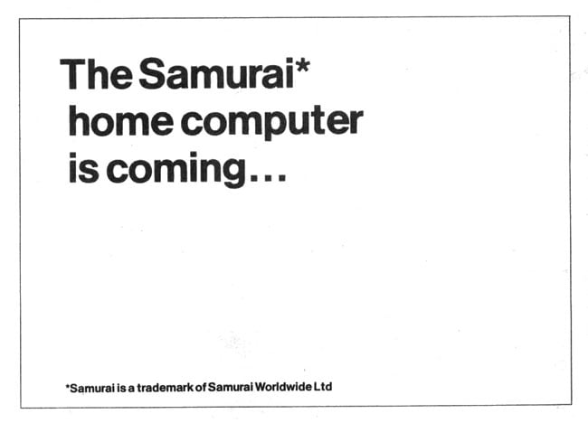
In a bid to establish its ownership of the name, Samurai placed ads in the computer press announcing that “the Samurai home computer is coming...” and stating that “Samurai is a trademark of Samurai Worldwide Ltd”. The ads said nothing more. They gave no indication of specs or pricing, or indicated when the machine might ship.
Robert Madge would later insist that Samurai had correctly registered the trademark, and done so before Micro Networks had launched its business micro. But a check of the UK current trademark database, which goes back well beyond the years we’re considering here, reveals the only ‘Samurai’ trademark registered in 1983 was for a brand of Italian toothpicks. Whether IS failed to register the trademark correctly, the application was for some reason rejected, or it had simply not been granted in time to stop Micro Networks isn’t known.
Re-branding the box
Whatever the reason for Samurai’s failure to protect its preferred moniker, the brand was now judged to be unusable. A new one had to be found. ‘Oscar’ was briefly considered but soon dropped in favour of ‘Elan’, a name that it was hoped would suggest a dashing, stylish product, but would eventually prompt another, highly embarrassing change.
For the moment, though, other alterations were being made. The graphic designer brought in to devise the Elan’s branding and to create the look of the computer’s instruction manuals and brochures came up with a colour scheme of hard primary hues over a black background - undoubtedly reflecting, in Geoff Hollington’s view, what Sinclair had done with the Spectrum.

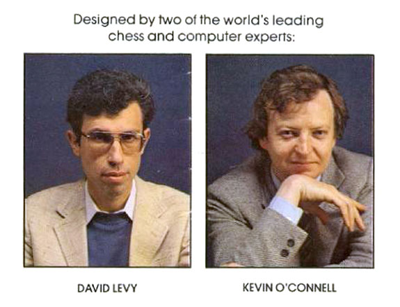
The Elan Enterprise was initially promoted on the brainpower of Intelligent Software’s founders, not on the skills of its real designers
Most likely the graphic designer suggested to Robert Madge that perhaps the computer should adopt the same scheme, but wherever the notion came from, it was soon made official, much to Hollington’s ire. Today he dismisses the machine’s red, blue and green keys, set on a pure black casing, as “Lego block colours”.
With a new name chosen, and development of both the hardware and the software proceeding apace, it was decided to launch the new computer, now also dubbed the Enterprise. Elan began briefing the press in August 1983, in particular emphasising David Levy’s background as a chess champion and thus IS's software brainpower. Perhaps IS hoped to spoil the long-delayed launch of the Acorn Electron, which took place that same month. During the briefings little was said about the computer itself - not on the record, at least.
