This article is more than 1 year old
Chrome 38's new HTML tag support makes fatties FIT and SKINNIER
First browser to protect networks' bandwith using official spec
Google has recently pushed out Chrome 38, for desktop and mobile devices.
Google updates its browser every six weeks – so often, in fact, that much of the time there isn't much in the way of new or worthwhile features.
Not so with this release.
Among the changes Chrome 38 has support for new features in JavaScript, as part of the support for the ECMAScript 6 draft specification.
But the big news is Chrome 38 is the first browser to support the brand new HTML Picture element.
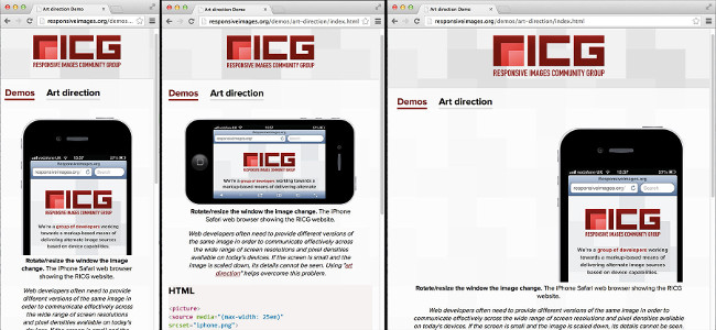
The Picture element is one of several new tools for web developers that lets websites serve different images based on the screen size of the device you're using. Though Picture gets all of the attention, much of the time developers won't even need the new element, just the new attributes for the <img alt=""> element.
What's the big deal? You’ve probably noticed it's increasingly common for websites to adapt their layout to fit your device. For example, on small screens a site might collapse menus and vertically stack content blocks that would be arranged differently on a larger screen. These flexible layouts are part of what's known as responsive web design. When done properly it means a single website, with all the same content, works well on every device.
Yet while developers have tools to handle changing the layout, there isn't much they can do about the size of images these layouts contain. While an image might be scaled down to fit your phone, behind the scenes your browser still downloads a large file. That's a waste of bandwidth – sending a huge image to a tiny screen. So, when building responsive websites, developers have resorted to various hacks when handling images. Until now.
The Picture element and the new attributes available on the good old <img alt=""> element change that. As Google puts it in the Chrome 38 announcement, these new responsive image tools "bake an elegant solution right into the web platform".
For now, Chrome 38 is the only browser with support for responsive images, though Opera 25 will have support when it emerges from Opera's beta channel. Firefox will also support responsive images in a release later this year, and Microsoft’s Internet Explorer team has indicated that responsive images support is on their roadmap as well.
Chrome may be the first web browser to support responsive images but the fact there's a solution at all has not come about thanks to some standards body or innovative browser developers, but thanks to the efforts of the web development community as a whole.
The responsive images community group at the W3C, led by developer Mat Marquis, developed the specification for the new Picture element and the new attributes on the <img alt=""> img element. The spec took several years and a lot of hard work from several dozen core developers – but a spec is just so many words until a web browser actually starts supporting it, which is why Chrome 38 is so important.
Support for responsive images in Chrome 38 is largely the result of developer Yoav Weiss, who helped implement support for responsive images in Chrome as part of a successful crowdfunding campaign.
The net result of all this effort for users are websites that are faster and lighter on your mobile's data plan.
If you'd like to see the new responsive image support in action, make sure you've got the latest version of Chrome and head on over to this responsive images demo. ®

