This article is more than 1 year old
LARGE, ROUND and FEELS SO GOOD in your hand: Yes! It's a Nexus 6
Software – THAT's what'll sell it
My girl Lollipop
The Nexus 6 is the showcase machine for the fifth major version of Android, codenamed Lollipop.
On release date, or shortly afterwards, other Nexus and Motorola handsets will be upgradable to Lollipop but the Nexus 6 is designed to run the new operating system to its limits. Based on early usability testing the latest build is a significant improvement in a lot of areas, but not all.
The biggest weakness comes when you turn the Nexus 6 on. We moaned about the Nexus 5 taking over 20 seconds to boot, but with this model booting up the phone from cold took an average of 31 seconds to get into gear, and that's on factory reset level. Load it up with apps and the boot time takes considerably longer.
But once you're got the Nexus 6 going then the device is very easy to configure if you have a Google account. Settings, apps, and passwords are all easy to transfer, although it takes time and bandwidth, so make sure the Wi-Fi is connected before beginning unless you want a hefty bill from your network provider.
Google has made much of its new Material interface design but the response from this reviewer is a decided "Meh" - sure, the icons look slightly better but there's little there to excite the user in terms of pure look and feel – although the smoothness of the screen movements is much better than the last Android build and it remains to be seen what developers can do with the Nexus 6's quad-core processor and GPU.
That said, screen response times are noticeably faster in Lollipop and a lot of that is down to a new virtual machine called ART, which replaces Dalvik. Google claims a 2X performance boost with the new engine and it appears to have paid dividends in terms of graphics performance.
The first thing you notice about the new build is that the icons at the base of the screen have changed, becoming more geometric and reminiscent of a games controller. The Home button is now round, the left-hand back button is an equilateral triangle on its side, and the applications viewer is a square.
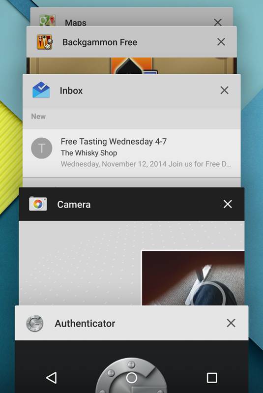
It's in the latter button that users will see the most change. Instead of displaying running apps in as 2D screenshots, Lollipop presents them as a 3D rolodex that can be flipped though at will. It's a good looking design, and the only quibble would be the kill button in the top right of each app is too small, so it's easier just to swipe them to the right of the screen to get rid of apps.

