This article is more than 1 year old
Facebook unveils SECRET logo furtle – in a TWEET
Still white on blue, but now with custom typeface
Facebook has revealed its new logo - somewhat bizarrely, in a Tweet.
The Social Network™'s product designer Christophe Tauziet popped out this missive eary on July 1st.
Say hello to the new Facebook logo pic.twitter.com/ofoFm4JQmK
— Christophe Tauziet (@ChrisTauziet) June 30, 2015
Under Consideration reports that the new logo was developed by Facebook's own designers with help from an outfit called Process Type Foundry that worked on the old logo and the typeface used in that effort, which we've popped in below.
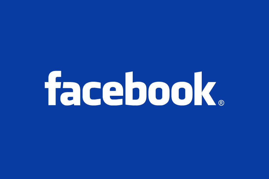
This time around Facebook has splurged on a custom font. The result is a slimmer logo, a change from a double-decker “a” to a single-deck version and a more distinct stem for the “b”.
Facebook's apparently decided it needed an upgrade rather than a replacement, to reflect maturity while also delivering continuity.
The result's much less bad than HP Enterprise's new effort – a green rectangle and conjoined pair of “t”'s, but perhaps lacks the whimsy Marissa Mayer felt was needed for the new Yahoo! logo she ushered in back in 2013.
Facebook users probably won't notice the change: all they ever see is the “F” glyph. And shareholders? If it flogs more ads, they won't give it a second look either. ®
