This article is more than 1 year old
We tried using Windows 10 for real work and ... oh, the horror
Better, worse, prettier or uglier?
Screenshot time: Here's Johnny
First things first. This is what Windows 10 looks like, just 23 days from launch. It boots into a standard desktop view. 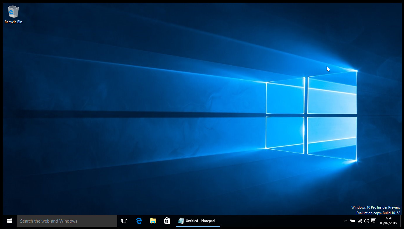
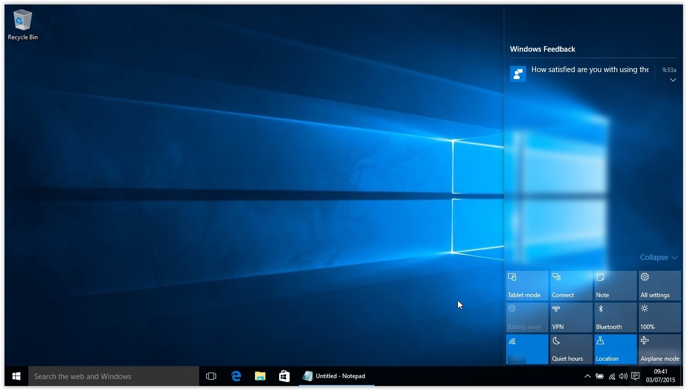
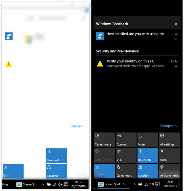
Tablet mode is invoked automatically when you detach a keyboard, or with a couple of clicks from the Action Centre, a new Notifications popout panel on the right – which is very like the Android notifications panel that almost everyone else copied. Only it pops out of the side, not down from the top. Switching between modes is a pretty smooth transition.
Essentially, the pure touch UI has been tossed out, and in its place you've got a "touch-friendlier" version of the desktop. Microsoft is no longer waterboarding users with the Modern touch UI.
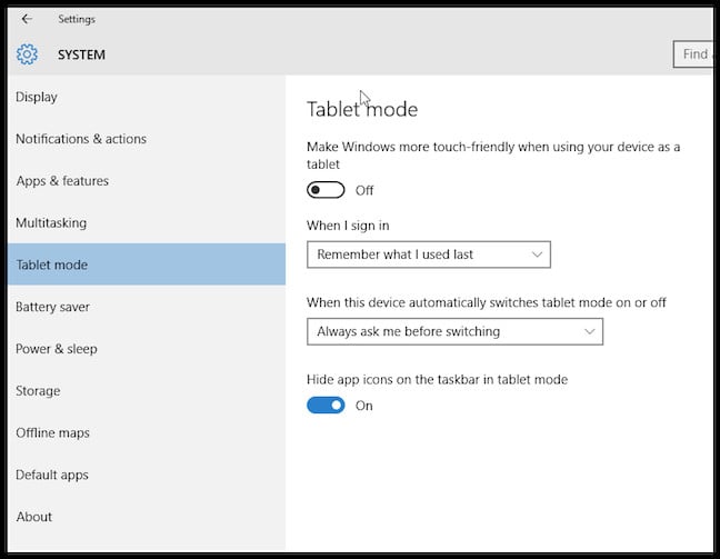
Set how you want tablet mode to appear
The Action Center occasionally looked like the screenshot below left (the right image is what it should look like).
In fact, many will not even know it's there. When you start a Modern app from the Desktop it runs in a window. Gestures and controls that were central to Windows 8.x have also been binned.
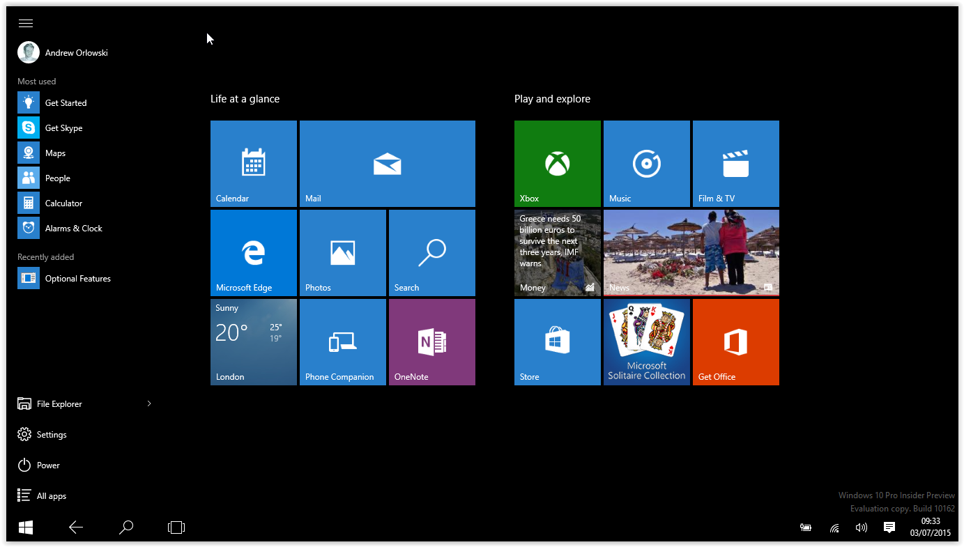
Out with the old, in with the new
In their place are new conventions and controls: modern apps and the Tablet mode start bar have back buttons. If you're mostly on Windows 7, the effect is far less jarring. If you drank the Sinofsky Kool-Aid, accepted the pain, and learned the conventions of Windows 8.x, then you're going to have learn things all over again. Sorry about that.
Speaking to Microsoft, it's clear that the reason for these changes is to bring over the 90-odd per cent of the installed base that's currently on Windows 7 or Windows XP. So smoothing the transition is the priority.
This is clear from the visual similarities between Desktop and Tablet modes, which are apparent once you click the revised Start Menu. But I'll get to that in a minute, because using Tablet mode in its current state needs some caveats. Like much of the Windows 10 "experience" (Microsoft is very keen on "experiences") it feels very ad hoc and last minute. Tablet mode in earlier builds was really problematic (see this pic), now it's merely weird and buggy.

This screenshot was taken in Tablet mode, with the cursor dragged to the top right corner, invoking a traditional menu bar. Ugh. For me this is fairly emblematic of the chaotic Windows 10 public preview, with developers just doing things and design decisions being deferred to the telemetry data (totting up who complains the least), or postponed to the last minute.
I suspect that this because the scope of the Windows 10 project is now so grandiose - and genuinely impressive.
You should be able to take a Windows 10 phone, plug it into a monitor and keyboard, and use it as a PC. The apps will scale to a desktop friendly UI. The feature has been demoed under the name Continuum, and it's a splendid idea. Developing countries with low PC penetration will be able to take advantage of the phone industry's economics – and the underused powerful smartphone processors. But for now the real-life UX is a bit messy. Tidying up, I suspect, will be an live issue for quite some time.
For example, one of the several problems caused by the changes is that settings are again scattered to the winds; in Windows 8.x you could usually find what you wanted on the Charms bar. But there is no Charms bar in Windows 10.
