This article is more than 1 year old
It's official: Users navigate flat UI designs 22 per cent slower
Put in some chrome and shade
The mania for "flat" user interfaces is costing publishers and ecommerce sites billions in lost revenue.
A "flat" design removes the distinction between navigation controls and content. Historically, navigation controls such as buttons were shaded, or given 3D relief, to distinguish them from the application or web page's content.
The mania is credited to Microsoft with its minimalistic Zune player, an iPod clone, which was developed into the Windows Phone Series UX, which in turn became the design for Windows from Windows 8 in 2012 onwards. But Steve Jobs is also to blame. The typography-besotted Apple founder was fascinated by WP's "magazine-style" Metro design, and it was posthumously incorporated into iOS7 in 2013. Once blessed by Apple, flat designs spread to electronic programme guides on telly, games consoles and even car interfaces. And of course web sites.
Flat designs looked "cleaner" and more "modern" (Microsoft's subsequent portmanteau term for its Metro design), but there was a price to pay.
The consequence is that users find navigation harder, and so spend more time on a page. Now research by the Nielsen Norman Group has measured by how much. The company wired up 71 users, and gave them nine sites to use, tracking their eye movement and recording the time spent on content.
"On average participants spent 22 per cent more time (i.e. slower task performance) looking at the pages with weak signifiers," the firm notes. Why would that be? Users were looking for clues how to navigate. "The average number of fixations was significantly higher on the weak-signifier versions than the strong-signifier versions. On average, people had 25 per cent more fixations on the pages with weak signifiers."
The firm dispenses with the counter-argument that users were "more engaged" with the page.
"Since this experiment used targeted findability tasks, more time and effort spent looking around the page are not good. These findings don't mean that users were more 'engaged' with the pages. Instead, they suggest that participants struggled to locate the element they wanted, or weren't confident when they first saw it."
This translates to billions lost in engagement revenue or transaction revenue.
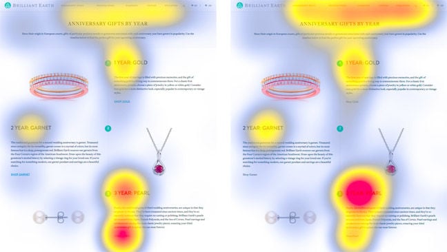
You can see the effect clearly in this example.
The version of the page on the left has stronger "signifiers", i.e. navigation, while the page on the right is more "flat". On the flat design, users spend more time lingering on the caption "3 Year Pearl" than they do reading about the 3 Year Pearl.
If you don't create many pages, or don't need to direct users to a specific location and are happy with them being on one page, then flat design can be acceptable, the experts conclude.
Microsoft is slowly edging away from the flatness imposed on Windows, with its acrylic UX. Very slowly, if their design documents are flat. ®

