This article is more than 1 year old
We live so fast I can't even finish this sent...
And she wore Pantone 19-4052 TPG Velvet
Something for the Weekend, Sir? Call me an idiot* but I have no idea what you are talking about, why you're saying it or indeed what's going on any more.
Oh, and welcome to the Year 51-85-139.
Do you know what I'm talking about? No? Then you know exactly what I'm talking about.
Worried that my weekly outbursts of cynicism here might simply betray a weakening grip on the fast pace of tech disruption, last summer I began reading futurist Tom Cheesewright's High Frequency Change. The book tries to explain why idiots (ie, anyone who isn't a futurist) perceive modern tech business as being founded on the cult of fleeting unsustainability, and how to go about convincing oneself that it isn't.
Unfortunately, I never got past chapter three as I had other pressing things to do. By the time these were half-done, I'd moved on to other things. Sorry, Tom, but that's how it is these days. Always looking to the future, me.
What I did learn from the book is that things are not really intended to make specific sense as they whizz by across a rapidly morphing cultural landscape so there's no point worrying my idiotic but pretty little head about questions such as "why?"
For example, did you guess what the aforementioned "Year 51-85-139" business was about? Well, colour experts Pantone have declared its Classic Blue ref. 19-4052 TPG (that's 51 Red, 85 Green, 139 Blue) to be the theme colour for 2020.
Here it is. Now you know what 2020 is going to look like.

My (clearly foolish) reaction to this news is to wonder why a year should be assigned a colour from a Pantone reference library. Is it like the 12-year cycle of Chinese animals? Or is it a plot by rogue freemasons to design a coat of arms replete with colour symbolism to revive the Knights Templar with the support of Vatican 2 agents, Agnes Nutter and Bigfoot? Are we being led annually towards an ultimate Pantone reference that lies beyond the spectrum of human visibility and whose first implementation in a CSS tag will trigger the awakening of the Old Ones?
Nope. The idea is to buy a Pantone 19-4052 TPG espresso mug and keychain, then turn our goldfish-like attention to the next thing. Trying to make sense of it is an idiot's game. Don't stand still, move along please.
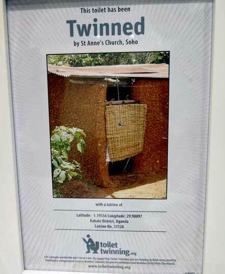
I found that if you spend long enough wondering "why?", your brain tricks itself into deducing a ludicrously unlikely purpose behind this stuff and then convinces you that it makes sense. For example, take this advertising poster I found just inches from my face when I nipped to the gents during a journalists' Christmas bash in the typically drunken and debauched surroundings of a central London church.
You've heard of town-twinning, right? Well, the latrine into which I was artlessly jimmy-riddling at that very moment had been twinned with the one pictured in the photograph, in Uganda. For those of you working in spy agencies seeking something to stave off the workplace boredom other than secrete "always-on" code into other people's Alexa skills, have a peek at the Ugandan convenience at your convenience via live satellite: the map references are given on the poster.
Nice logo at the, er, bottom. Shitting infographics, it's all the rage, didn't you know?
Give yourself five minutes and I'm sure you can come up with a valid and worthy reason for toilet-twinning to exist. However, I think you might be missing the point, which is that there isn't one. It's a thing, that's all. Move along please, zip it up, let the next customer have a go. By the time you've Googled toilet-twinning, the fad will be over and replaced by fridge-twinning or eraser-at-the-end-of-a-pencil-twinning.
It's not that earnest charitable endeavours are mere objects of smug amusement so much that everything has become slave to the prevailing culture of short-termism. We exist in an era where are unproven, unworkable ideas change ownership for billions of dollars and failed businesspeople are hailed as heroes that we should try to emulate.
At this point, your brain's reasoning function stumbles into cynicism. My smartphone, my car, my trousers: I'll get around to changing them all soon enough, so why bother giving it any serious thought?
And so here we are, welcome to my world. This is how I handle high-frequency change, Tom: I ignore it or take the piss out of it.
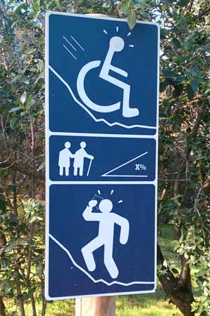
Talking of public signs, here's one I saw in a local park on New Year's Day. It warns visitors that a steep hill lies ahead. It is particularly heart-warming that the infographic-inspired icons target three very specific types of park user: someone in a wheelchair; oldsters sharing a stick; and my Dad.

Hang on… isn't that Pantone Classic Blue?

* content experience user interactivity prompt

