This article is more than 1 year old
GitHub redesign goes mobile-friendly – to chagrin of devs who shockingly do a lot of work on proper computers
Code shack is a great place for others to collaborate, but not so strong at collaboration for itself
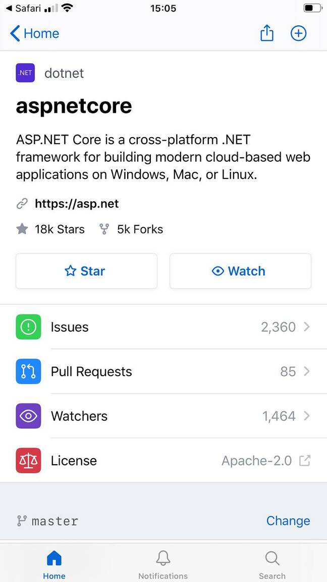
GitHub has redesigned its web repository layout for an "improved mobile web experience", but developers were quick to find flaws in the new approach.
GitHub said that its new design has three key features. First, a responsive layout to improve usability on mobile web browsers. Second, a repository sidebar for surfacing "more content". Third, the ability to show and hide releases, packages and environments in the repository sidebar.
The team promises that this will be the foundation for future improvements to accessibility along with a dark mode option.
Much usage of GitHub does not require visiting the site. Integration with IDEs and code editors is strong, or you can use the GitHub Desktop application, or direct Git commands. Many important open-source repositories have a bare-bones web UI, like this one for LibreOffice. Performance is good and developers have all they need for managing code.
Sites like GitHub and rival GitLab, however, have ambitions beyond hosting code. They are constantly adding DevOps features, like GitHub's Workflow Templates, designed to make it easy to get started with Actions, GitHub's mechanism for automating code build and deployment. There is also the matter of collaboration with team members who are not developers, but may need to engage with issues and discussions that are part of a project.
The new design does look better on an iPhone, but developers with big screens are not so impressed. "The single worst change is that you can't see the latest commit status from the repo screen. Instead, you get the commit hash, and have to click a tiny ellipsis button to get the commit message and the status indicator," said one developer on Hacker News, winning a response from GitHub CEO Nat Friedman, who said: "This is something we should definitely fix."
There is also a suspicion that GitHub is going for prettiness over information density, though Friedman said: "I don't think there is a principle of lowering information density at work here. I think it's just a design that we will keep iterating. We are pro information density at GitHub."
Too much white space is a common complaint. "Large patches of white really hurt to look at for any real amount of time," said another developer, though Friedman confirmed that dark mode is on the way. Another issue is the width of the layout. "They place content at extreme ends of the screen, completely stretched out like a rubber band," said one.
Some feel that the redesign was rushed without any real consultation. It was an optional preview for a short time, but "you just rolled it out for a couple of weeks basically to see if there were any showstopper bugs before you went live," complained a user. Another challenged, "In what ways do you consider the new design to be better?"
It is not all negative, though. "It's a positive improvement. Better information layout, and the code is still front and center," said another commenter.
The introduction of the new design highlights an oddity about the Microsoft-owned source code management and developer collaboration service, which is that its own development is more top-down than collaborative. "Where do I post feature requests for GitHub?" asked a user in November 2018. GitHub then introduced a feedback form, where requests go into the black hole of "We read and evaluate all feedback carefully, but we may not be able to respond to every submission."
Microsoft at least has its UserVoice forums where users can both submit feedback and vote on feedback from others – like this one for Office 365 or this for Azure.
Strange to say, but GitHub could do with a little more collaboration. ®

